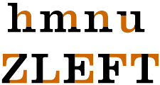
 Optical relationships within a successful typeface have a structural integrity, or unity, when all of the characters visually relate to each other. Thicks and thins are consistent, interletter and interword spacing create an even tone, or color and the typeface has an overall visually appealing appearance.
 When you create a typeface everything won't automatically lineup. Special consideration needs to be given to many areas that have optical relationships occurring. Some of these instances will be mentioned here, but it is up to the typeface designer to ensure that the final typeface has no improper optical relationships. The optical relationships that will be covered here are: pointed and curved letterforms, two-storied capitals and figures, curved strokes, diagonal and vertical strokes, horizontal strokes, tight junctions, and closed counterforms.
Pointed and curved letterforms
 –Usually there is little weight at the top and/or bottom of pointed and curved letterforms. This may make them appear to be smaller than the letterforms in the typeface that rest squarely on the baseline. To help prevent this from happening, the axes of pointed letterforms are placed beyond the guideline (either the baseline or capline) that they rest upon. Curved letterforms are drawn slightly beyond the guildelines that they rest upon.
Two-storied capitals and figures–
 The top half of two-storied capitals and figures usually appears too large when they are divided equally. To prevent this from happening and achieve an optical balance, the center is slightly raised above the absolute center of the letterform and the top half is drawn slightly narrower than the bottom half.
Curved strokes–
 At mid-stroke, curved strokes are usually thicker than vertical strokes. This is done to achieve an even optical appearance.
Diagonal and vertical strokes–
Horizontal strokes–
 To avoid appearing too thick, horizontal strokes should be drawn slightly thinner than both vertical and curved strokes.
Tight junctions–
 When two strokes meet at an angle, the junction may appear to thicken. To prevent this from happening, the stroke junction should be opened slightly to allow a little extra white space in.
Closed counterforms–
 Optically balancing a letterform with a closed counterform can be done by drawing the letterform with a slightly smaller with a stroke weight that is slightly thinner than letterforms with open counterforms.
© 1998-2022 Ty Hatch. All Rights Reserved.