
Designing beautiful type is swiftly becoming a lost and unappreciated artform. With the advent of the Internet, fonts have become so easily obtained that you don't think much about the effort that goes into designing a successful typeface. Shown here is a brief glimpse of what goes into designing type. Remember, type is an artistic expression, and so the process that works here may not be the one for you.
Beginnings–When designing a typeface, the first step is deciding what kind of typeface to create. There are two fairly broad categories to select from. Text typefaces are used in the design and layout of documents that require a highly legible and readable typeface. Display and Experimental typefaces are mostly used for headlines and tend to be the more expressive of the two types of typeface that you can create.
One thing that may help you decide what to design is setting some design objectives. This will help to focus on what you are designing and help you to create the best possible typeface.
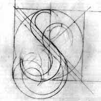
For the typeface that I use as an example, I wanted to see what kind of letterforms could be created by using some old engineering circle and square templates that I had hanging around my studio. I took my inspiration from Ed Fella's OutWest typeface that he created with a 15 degree ellipse template (If you're interested in it, it's available from Emigré).
 Roughs–Once you've set some objectives, it may be useful to do a bit of research to see what can be done differently to give your typeface a unique look so it will stand out from the crowd.
The next step is to begin drawing. The first few drawings should be to just get your idea out and on paper, they don't need to be fancy or perfect, just get the idea out. These are called roughs. Once you've done this, you need to do some more detailed drawings and refine your characters, or letterforms.
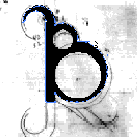
Scanning–When you have reached a point where all of your letterforms look the way you want, you're ready to bring your drawings onto the screen, or you may do a final hand drawn rendering of your typeface in ink before you digitize them. Digitizing your drawings is done by scanning. You don't need to scan at a super high resolution, 72 or 96 dpi will do nicely.
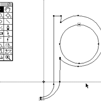
 Final Drawings–Having scanned in your drawings, you can now work on the final digital version of your typeface. This can be done in an illustration program, such as Adobe Illustrator™ or Macromedia Freehand™, or directly in your font editing software, such as Macromedia's Fontographer™. I chose to do my final drawings in Illustrator™.
 The Font–Final drawings complete, you can now work on your typeface in your font editing software. Fontographer™ is what I used. There are some other font editing programs out there, but Fontographer™ is the most popular and easiest to use. If you created your typeface in Fontographer™, then don't worry about importing you final drawings into Fontographer™, but if you did your final drawings in an illustration program, you will need to transfer them into Fontographer™ before you can continue.
Once you have your character set in Fontographer™ , you can now generate your font. Of course, if you want to do a bit more work so that your font will perform for a wide range of users, you need to spend some time in Fontographer™ working on the details. I won't go into them now, but you should be aware of them.
Last Words–You are now ready to install and use your font! If you want, you are interested, I've listed some links for some type houses that might have online submission guidelines. Good Luck!
© 1998-2022 Ty Hatch. All Rights Reserved.